


Upper Label 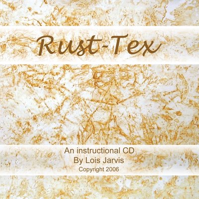 Vote for me
Today was a perfect day for rust dyeing. I have lots of fabric prepared, lots of rusty items, and lots of ideas. The thing I did not have today was lots of time. Our youngest daughter leaves tomorrow for three weeks in a counselor in training program. I spent most of the day doing things to for her. She reciprocated by designing the label for the Rust-Tex instructional CD. She likes one. I like the other. Please vote for your favorite by leaving a comment. Thanks!
Vote for meToday was a perfect day for rust dyeing. I have lots of fabric prepared, lots of rusty items, and lots of ideas. The thing I did not have today was lots of time. Our youngest daughter leaves tomorrow for three weeks in a counselor in training program. I spent most of the day doing things to for her. She reciprocated by designing the label for the Rust-Tex instructional CD. She likes one. I like the other. Please vote for your favorite by leaving a comment. Thanks!
No vote for me!!!
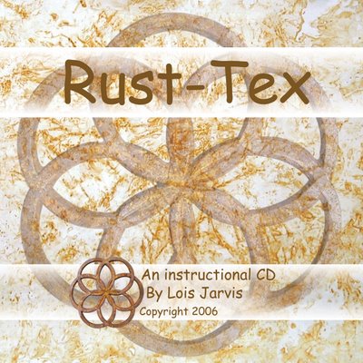
Lower label
13 comments:
My vote goes for the lower label, more graphic, stands out and reads as professional. I'd trust the product within much more than with the other label.
I like them both, but Elena's right - the bottom one is more graphic and looks more professional.
Hugs, Jan
I vote for the upper label - simple is better. I like being able to see the rusty fabric without the over-dyed design.
Upper label all the way ... clear simple and not to cluttered... more your style I would have said.
Sandy
If it's down to these two choices, my vote goes for the upper label, as it's more straightforward. The interlocking circles on the lower one remind me of a church window, and I can't puzzle out the connection between that and either rust or textiles... (I wonder that you don't use your rusty heart?) Also, I'd make the "Copyright 2006" font smaller, and either put the "By" in lower case or capitalize "instructional."
I'm not familiar with a color called "daub." Do you by any chance mean "taupe" (rhymes with "rope")? It is a brownish gray...
I'm with Sandy, Anonymous, and Jana--the upper label gets my vote!
Diane
Jana, The color "daub" is light khaki. The interlocking rings is an iron trivet I use in the Rust-Tex studio. It will be featured on the CD in a section called "Image Transfer" which shows how to "print" iron images onto cloth.
I like the lower one best, too.
Lois, I preferred the lower label even before you explained the origin of the image. Now, for sure, I vote for it.
You all have to remember this will be the CD label, so it will be a circle and have a big hole in the center of it.
I like the simplicity of the top one.
I vote for the upper label, I like the clean simplicity of the rust fabric
I prefere the upper one
Post a Comment